new
improved
Navigate to the top!
Look up! 🔝
There's no hiding our latest product release - it's right there for all to see. Can't be missed. Just look up - way up!

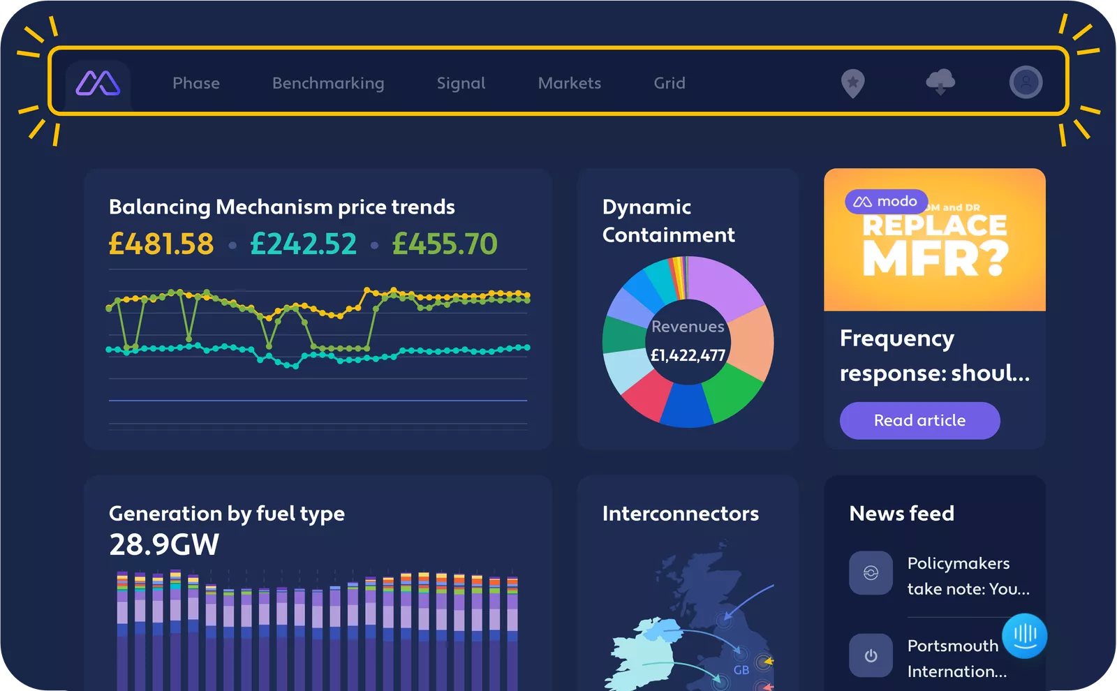
Yes, Modo has a fresh new look and feel! The much-loved Modo left-side navigation, with our borderline cult classic icons, has been retired. As much as the icons were.....iconic, some users also found them slightly confusing. The new top navigation shirks icons for clear titles, making it easier for our users to understand what is available at Modo quickly. You'll also notice we've shuffled the order of the platform sections so that our most popular and highest value features are easier to access.
There are still a few icons on the top right - these are now focused purely on a growing suite of what we call Tools (more coming soon). Tools are multi-purpose and interactive parts of Modo from which you can extract your own insights, for example, our Map and Data Downloads.
Hover on your avatar in the far top right corner, and a dropdown menu will appear, allowing you to quickly switch between dark/light mode (for those late-night Phase article reads) and access all your account settings.
Oh and one more thing: The empty space in the middle of the top nav bar is reserved for something exciting coming soon. Any idea what it could be?
We hope you enjoy the fresh new face of Modo. If you have any comments or feedback, we always want to hear from you - get in touch with our team via the in-app chat or drop us your ideas for new feature requests. Keep making energy storage a success!